


One of the fascinating (and equally scary) things about being a creative person is the lack of boundaries that any particular goal can take on for us. I have emphasized the importance of creating a proof of concept on a small scale before aiming higher, but even when my own drawing process already considers this, there are times, like this past week, when I struggled to achieve my goal simply because I overlooked ambition and let overconfidence take over.
HORIZON
I have to admit that drawing landscapes falls out of my comfort zone, but it is indeed something I am willing to work on. The “Horizon” prompt word was the perfect opportunity to challenge my drawing skills on this particular matter. But I was so overconfident I could improvise the inking that I had to repeat the whole piece, mostly due to a lack of preparation. As you can see below, here’s the initial pencil sketch, which I was satisfied with, except for something I only noticed when I had to repeat it.
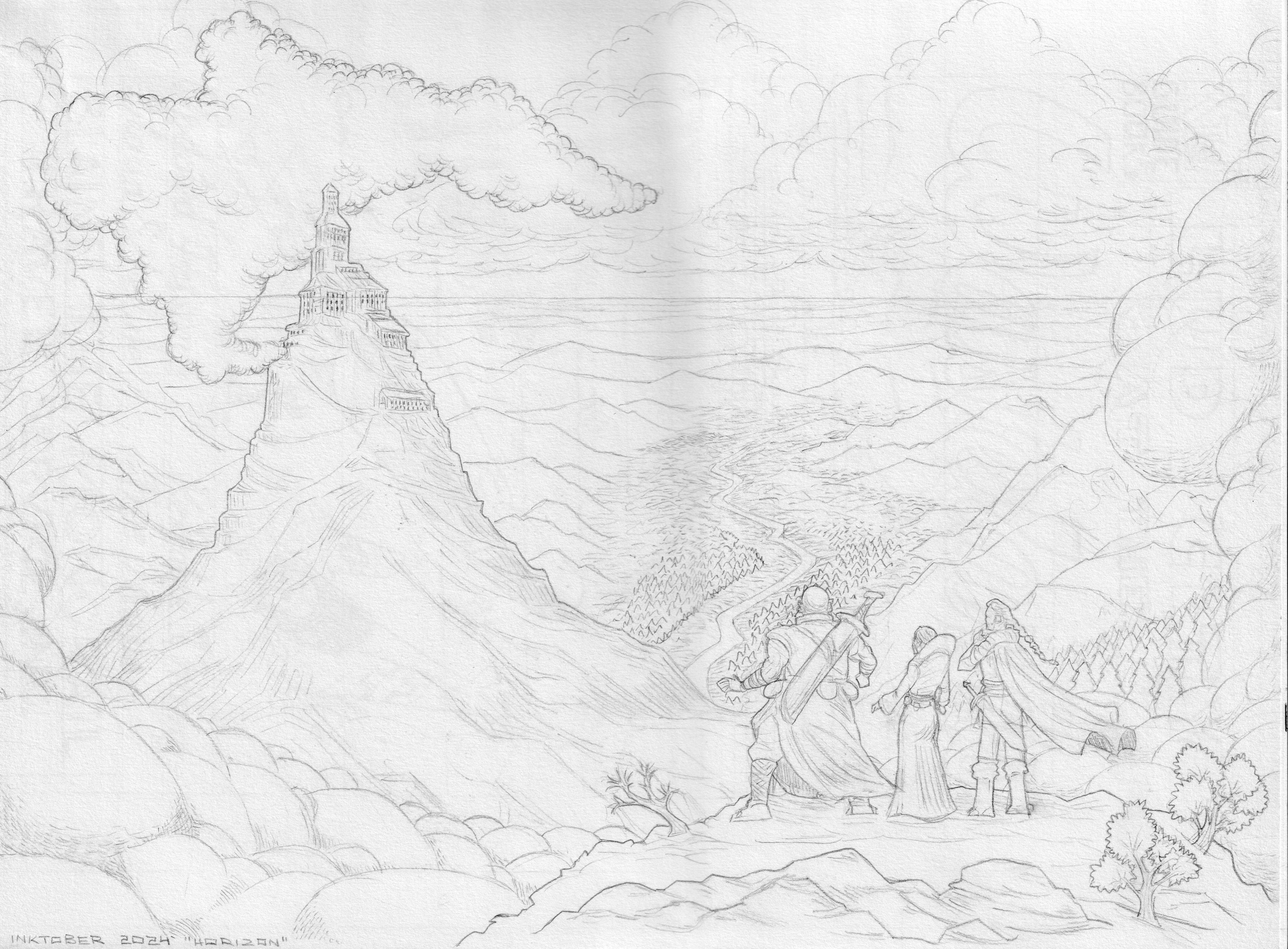
Normally, I take the time to figure out a brief idea of the inking while I am still doing the pencils. However, with this one in particular, I left almost everything to the moment of inking, which was a mistake because I ended up relying too much on what I could do with the markers.
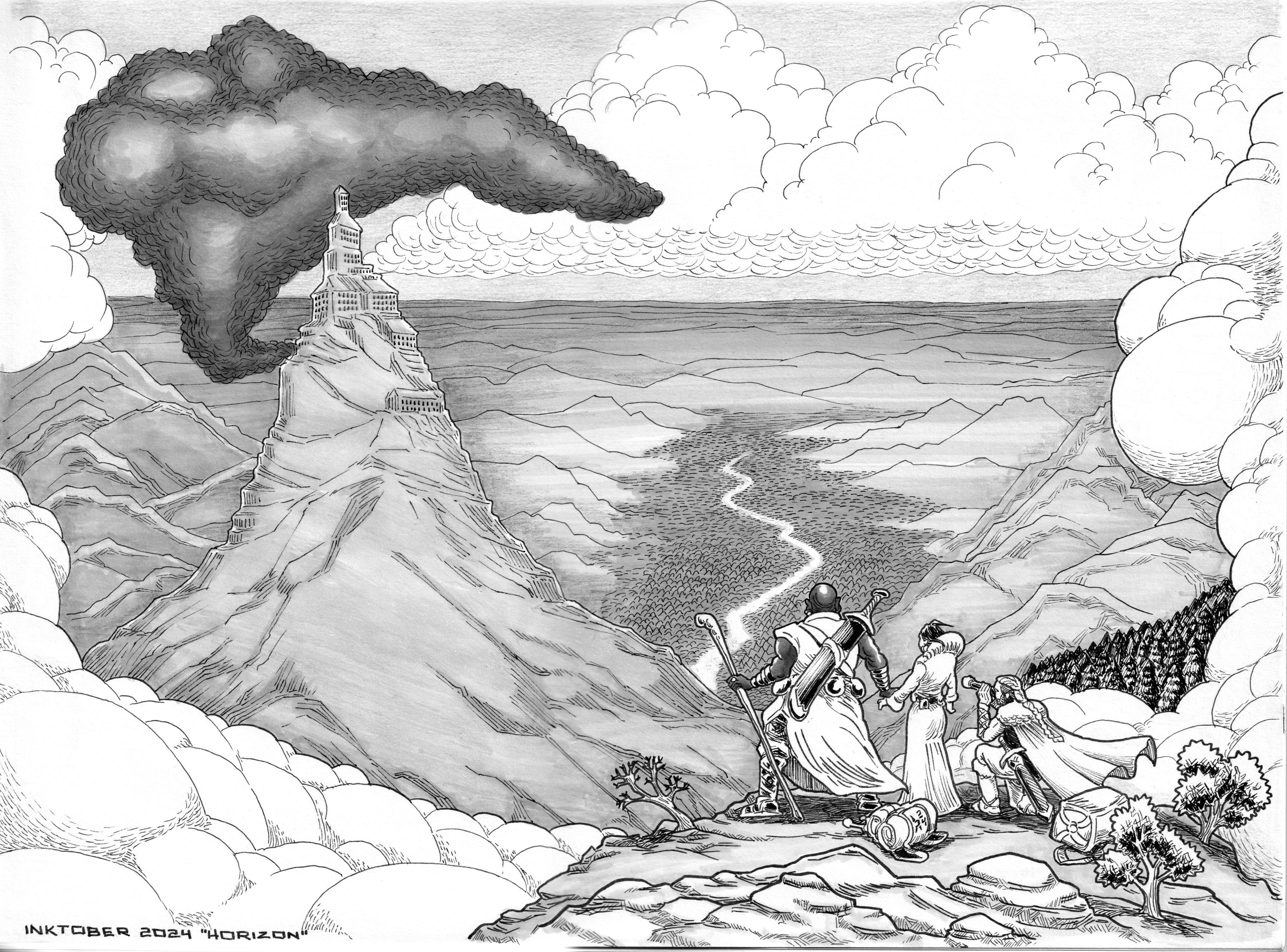
As can be seen, there are multiple problems with this version. The one standing the most is the smoke coming out of the fortress in the background. I tried to add volume to it, and because of that, it feels as if it’s popping out of the canvas and it attracts too much attention to itself. The second mistake I made was that I colored the land on the horizon and the mountain between the characters and the rest of the background with markers, making the whole thing look flat. Finally, the smoke was involuntary, giving a 9/11 feeling, which was far from what I was looking for.
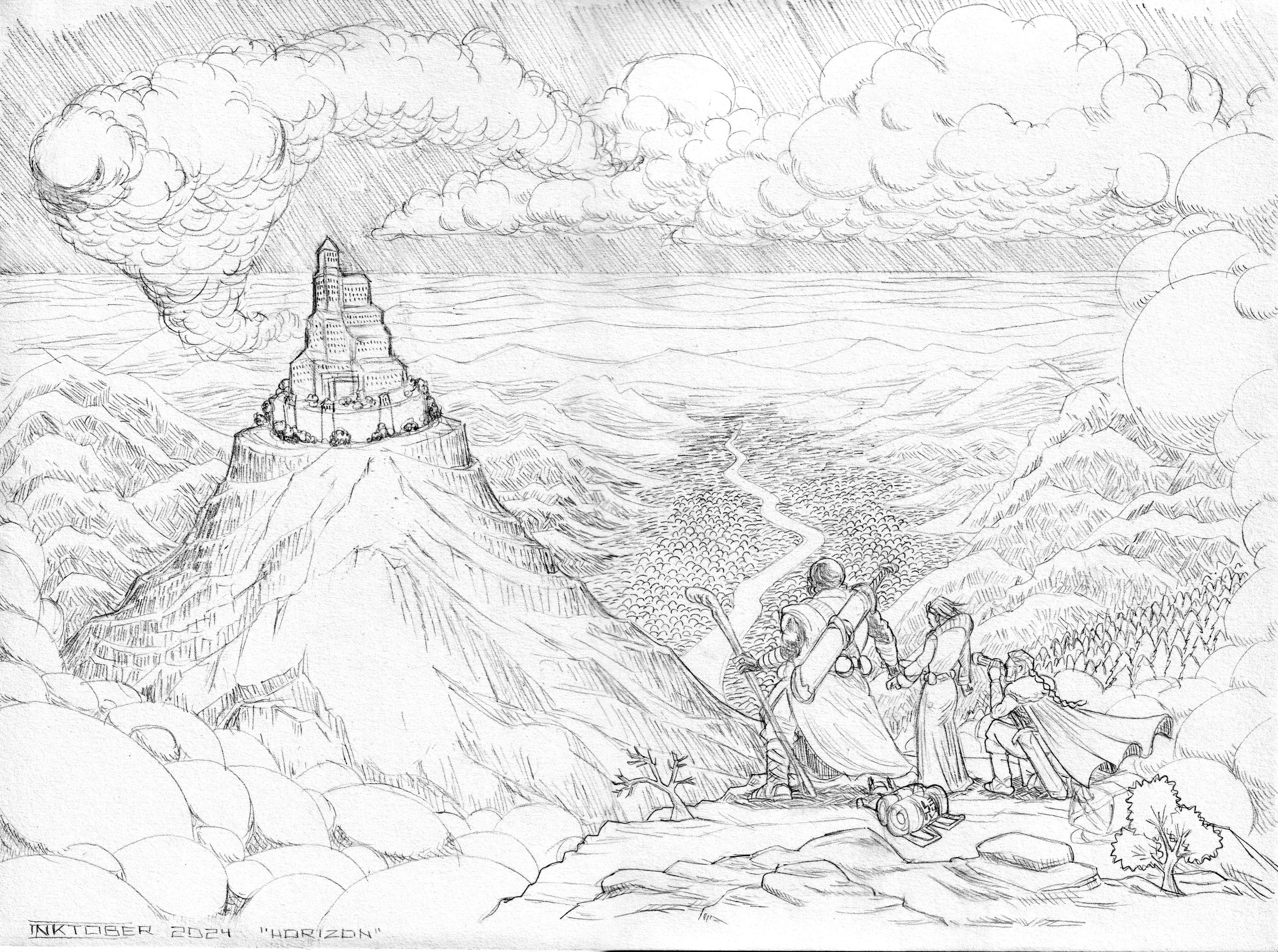
I had to repeat it entirely, so I re-traced the drawing with a pencil on a new canvas. This time, I placed the fortress a little bit lower since I felt the characters were already a bit below the bottom third. Also this time I decided to ban the use of markers altogether, I was going to rely on my inks to do everything, no matter the amount of cross-hatching and texture needed.
Here’s the pencil drawing, now with the inking preparation within the sketch.
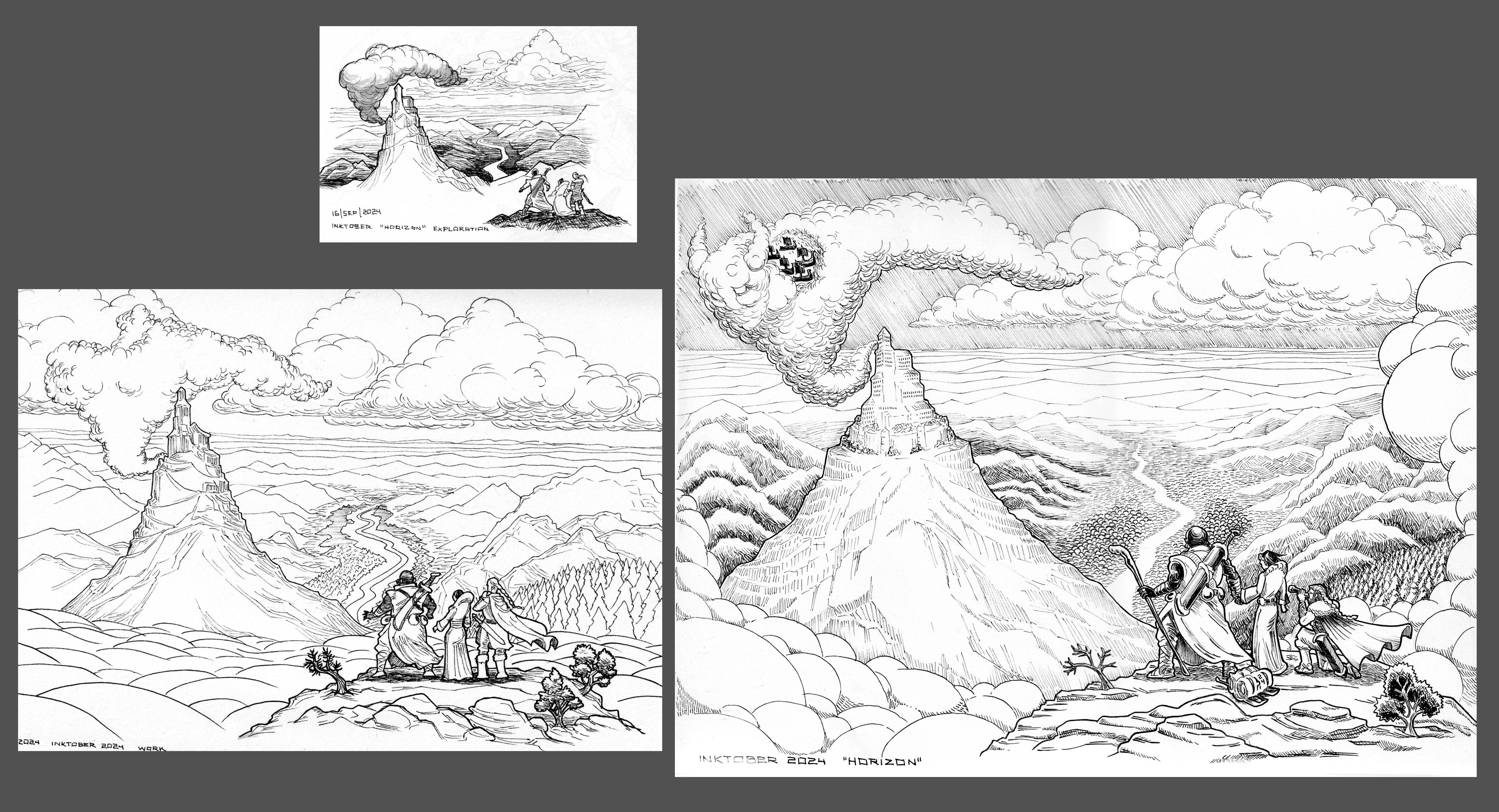
All these changes led me to the final piece, which I believe is way better than my first attempt, even though it took me a bit more work due to the amount of crosshatching I had to do when I got rid of the markers.
JOURNAL
Let’s talk about ambition. “Journal” was apparently an easy win since cartoonish compositions tend to feel smoother to me. However, the main challenge came at the time of inking since I had a very specific idea in mind on how it should look. Again, it didn’t help I had not figured out all the crosshatching upfront, particularly because I had a very specific idea in mind.
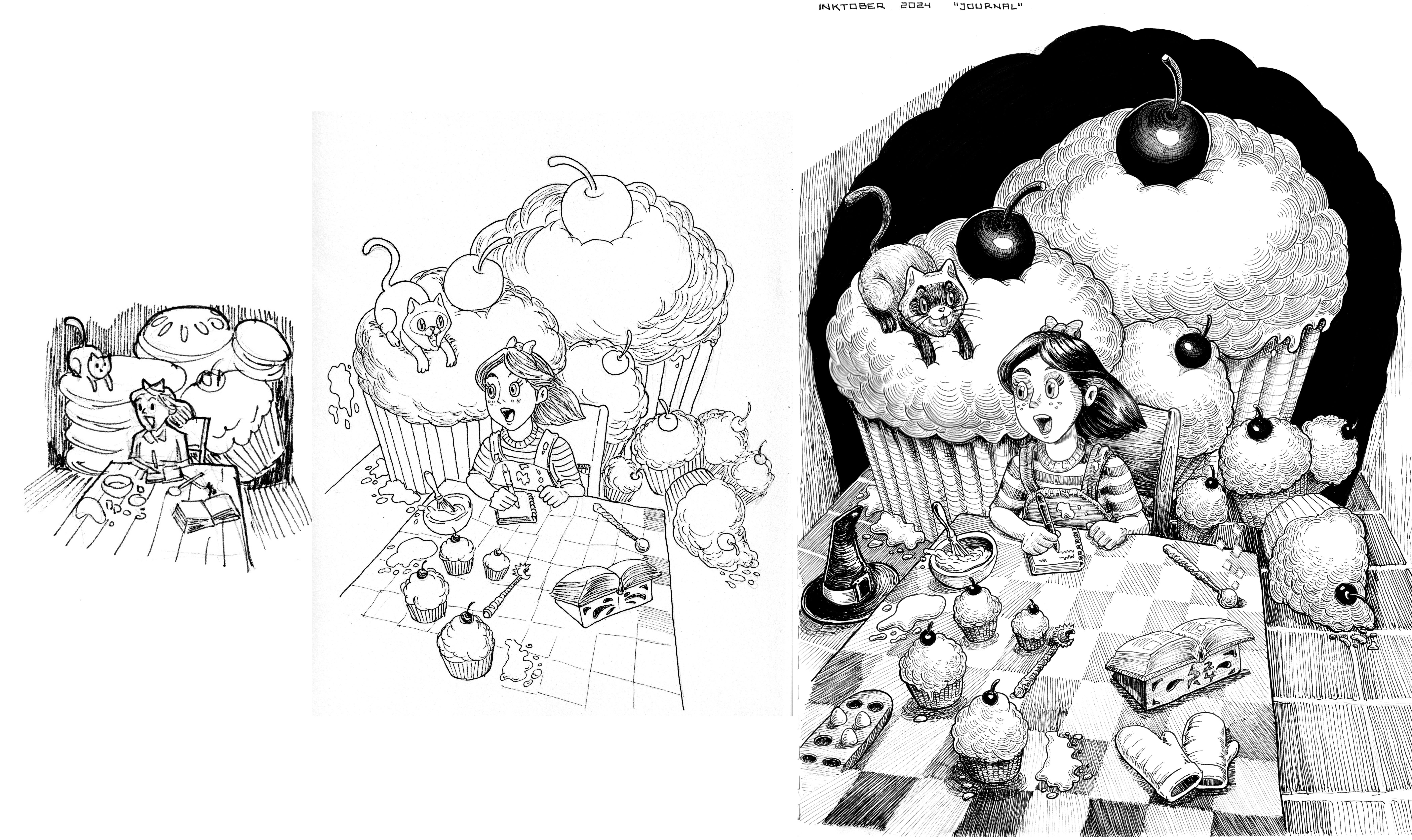
This idea was more of a technical goal: to depict light and shadow. I really wanted the giant treats in the background to look dark, but that also meant that I needed to show light in the foreground to create contrast. I spent a lot of time making the illuminated table and all the stuff on it, that I felt quite exhausted to darken the background fully. In the end, I liked how it turned out since I believe the storytelling goal came through and the illumination effect was achieved up to a reasonable point.
If you are curious, I recorded the inking process for this illustration (at high speed), which might give you an idea of the amount of work put into it:
If there’s anything I’ve learned that I want to apply to the upcoming fourth week of the Inktober challenge, it is to solve the inking idea within the pencil sketch and probably stick to the contrast achieved in my working sketches a bit more since most of them deliver well.
I hope you’ve found this insightful and you can apply any of these experiences to your creative work. Until next time.